Thinking about taking your data storytelling to the next level? You’ve come to the right place! If you take a page out of the playbook from some of the best data storytellers in the game, you’ll be set. Not sure where to start? Have no fear, we’ve got examples of 22 powerful data stories that’ll make your insights worth remembering. So sit back, relax and get ready to join an exclusive club of top-notch data storytellers – let’s do this!
What you'll find in this article
- 1 Why is data storytelling the future of data visualization?
- 2 22 Powerful data storytelling examples to find your inspiration
- 2.0.1 1. Decoding the fear – Covid-19 Most Common Symptoms
- 2.0.2 2. 100,000 responses and counting happiness – Nathan Yau
- 2.0.3 3. Making History – Brexit by Numbers
- 2.0.4 4. Triggering emotions – The Fallen of World War II
- 2.0.5 5. Can you predict a hurricane? – NASA GODDARD
- 2.0.6 6. Don’t underestimate the Visual Impact – Profiling the Parks
- 2.0.7 7. Against All Odds – MailChimp 2020 Annual Report
- 2.0.8 8. Design can drive impactful storytelling
- 2.0.9 9. The delight factor – Why Do Cats and Dogs…?
- 2.0.10 10. Reimagine meta-data in visuals
- 2.0.11 11. Examining Inequality – Gates Foundation
- 2.0.12 12. Relatable Data Storytelling
- 2.0.13 13. What’s your message? – What we eat makes a difference
- 2.0.14 14. Story at a glance – As the word turns
- 2.0.15 15. Creativity with public data set – Cicadas, A Data Story
- 2.0.16 16. Box Office Mojo – Chit Chart
- 2.0.17 17. Good storytelling simplifies data – How to forecast an American’s vote
- 2.0.18 18. Hand the reins to your viewers – The Rhythm of Food
- 2.0.19 19. No way Norway – Chit Chart
- 2.0.20 20. Put the spotlight on the numbers- What Africa will look like in 100 years
- 2.0.21 21. More or Less? – She Said More
- 2.0.22 22. Needle in Haystack – Which 2020 Candidates Have the Most in Common on Twitter
- 3 Honorary Mentions
- 4 How do you learn data storytelling?
Why is data storytelling the future of data visualization?
Visualizing data allows people to see relationships, patterns, and trends in the information you’re trying to communicate. However, it can sometimes be difficult for people to interpret visualizations without any background knowledge about the subject matter at hand. Luckily, data storytelling is another way to convey your insights visually. It provides an even stronger connection between your audience and the information you’re presenting by adding context and narrative to your data set.
A 2010 research study explored the effects of visual embellishment on information architecture. Most information design experts often suggest keeping ” chart junk” at a minimum in your presentations. This term loosely refers to overly embellished visualizations, charts, and bar graphs. However, in this research published in ACM (Association for Computing Machinery) Digital Library, it was confirmed that visual embellishments used in a narrative can increase comprehension and memorability of charts. Storytelling makes all the difference!
22 Powerful data storytelling examples to find your inspiration
There’s no limit to what you can explore or learn with data storytelling. Here are 22 data storytelling examples to inspire creating a powerful impact with your content.
1. Decoding the fear – Covid-19 Most Common Symptoms
There have only been a handful of global crises that have left as large an impact on us as COVID-19. People all around the world are united in their deadly fear of the virus. Many continue to suffer in the aftermath of its devastation. With this excellent data storytelling example, Chit Chart has decoded the severity of the COVID-19 symptoms and ranked them in order. The lighter color palette purposefully draws attention towards the two significant elements in the story- The thermometer and the core message – Not Everybody’s Got The Fever!
Key Takeaway – Find a relatable factor so your story is created from the perspective of your audience. This will present your story as a solution to their problem.
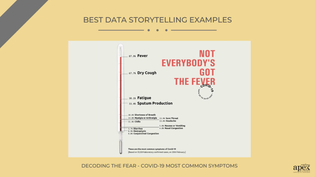
Source – Chit Chart
2. 100,000 responses and counting happiness – Nathan Yau
This is a great example of exploratory data storytelling when you have a huge pool of data driving your story. 10,000 participants listed ten moments each that made them happy recently. The Happy Database was created with these 100,000 responses. Yau broke down the data sets into moment clusters. He defined the reasons for happiness using parts of sentences. Here Subject denoted the Self Vs. Others. The Verb outlined the triggering action for happiness). Finally, the Object of the sentence was the identifying point of happiness. The use of pastels and flowy lines in the graphics is deliberate. It shifts the focus from the sheer bulk of the data.
Key takeaway: Start with any question you want to answer, and then use the data to tell the story. It keeps your story following a single direction. Like here they started with ” What makes people the most happy?”
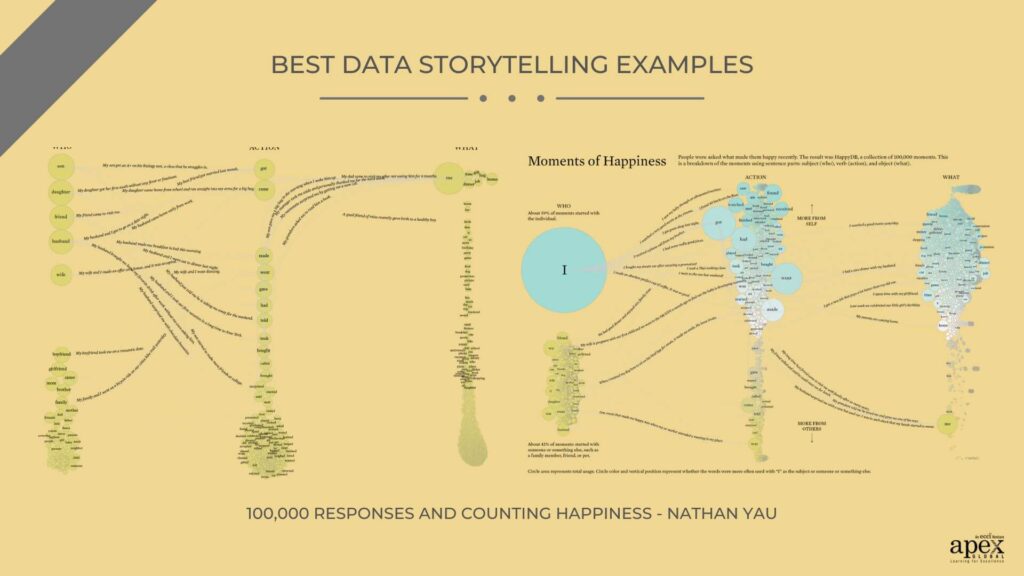
Source – Nathan Yau
3. Making History – Brexit by Numbers
The entire world was divided on the impact of the UK’s exit from the European Union. However, the sheer amount of information being thrown around was further confusing the decision-making process. However, this informative data storytelling example featured by Sky News tackled this very complicated topic with ease and precision. They used real data points to recreate the immediate global impact of Brexit. Sky News anticipated that such a complex topic might increase the bounce rate. To circumvent this, they have used bright colors and interactive visualization to keep the viewers engaged till the end.
Key Takeaway – The more complicated your data sets, the more attention should go to creative detailing and simpler visualization in the data story. Use precise numbers and short texts to drive your point home.
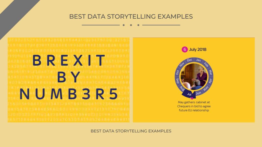
Source – Sky News
4. Triggering emotions – The Fallen of World War II
Halloran has used several elements of storytelling to make his data come alive. The visual design draws the viewer in. The stark white background highlights the red dots representing deaths. Each color has a purpose and helps convey the message. Halloran uses numbers to show how many lives were lost in each nation. With the massive data, viewers understand the full scope of the tragedy. Finally, an effective call to action ends the story. He includes links to organizations that are helping to preserve the memory of those lost in World War II. This encourages the viewers to act on their emotions by the end of the story.
Key Takeaway – Use multiple storytelling elements to create a compelling narrative. In this example, Halloran has used a combination of visuals, data, and a call to action. The purpose is to attract, affect and urge a reaction.
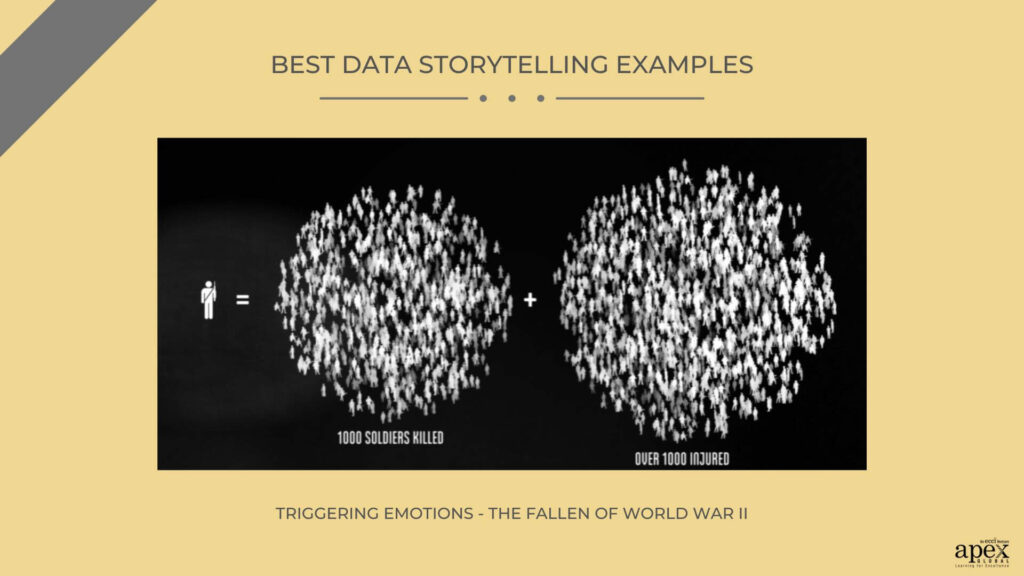
Source – Neil Halloran
5. Can you predict a hurricane? – NASA GODDARD
This project uses data-driven storytelling to explain the dynamics of a hurricane. At the center of the story is an animated map. It displays a current hurricane and its forecast trajectory. Other visual elements such as graphs, diagrams, and text provide the context. The data itself is used to illustrate the key points in the story. The animation is augmented with audio narration, which helps bring the visuals to life.
Key takeaway – if your story deals with complex concepts, simplify the narrative for your viewers. In this example, they have used a combination of visuals and narration to do that.
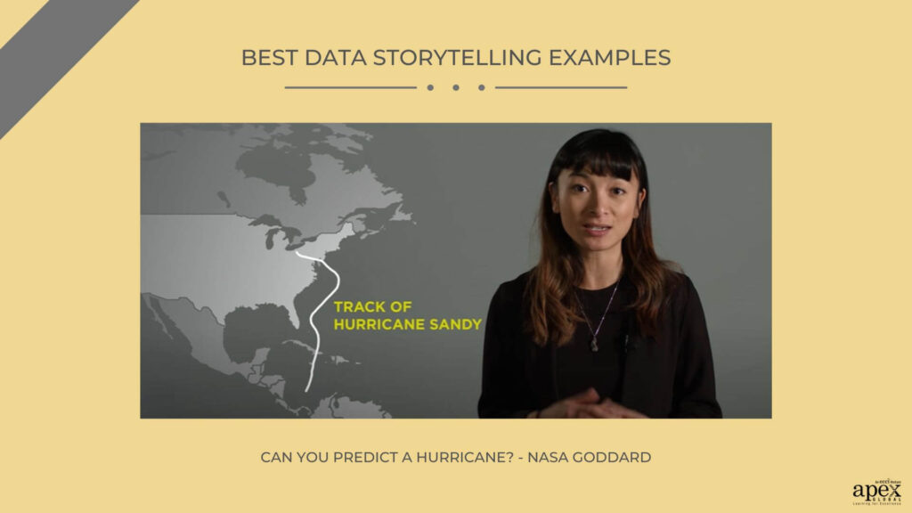
Source – Nasa Goddard
6. Don’t underestimate the Visual Impact – Profiling the Parks
The team behind Profiling the Parks has created a dynamic storyline. They have used interactive infographics to illustrate different aspects of each park. Clear, concise titles and descriptions outline each data point. This allows readers to quickly understand what they are looking at without having to dive into the details. The context and explanations make it easier for readers to interpret the data.
Key Takeaway – How you organize your content is critical for the structure of your story. In this example, each page design helps to show the features of the parks at a glance. Additionally, the team includes links to related projects and sources to provide even more insight and context.
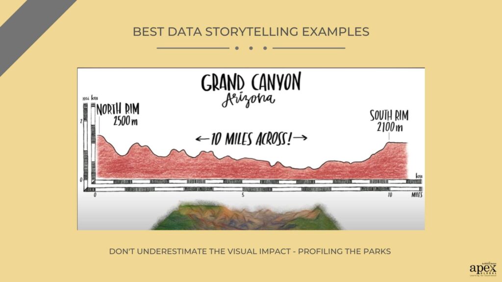
Source – Info we trust
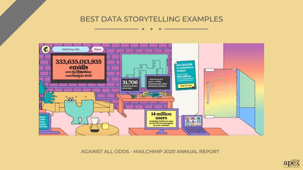
7. Against All Odds – MailChimp 2020 Annual Report
Against All Odds captures the spirit of resilience that drove Mailchimp’s growth in 2020. It explores the immense challenges posed by the global pandemic. Through anecdotes, quotes, infographics, and interactive features, the report keeps the viewers engaged until the very end. The bold color choices attract attention. While the data design specifically highlights the Key company milestones. They cover new product launches, growing the customer base, and expanding the team.
Key takeaway – Where the viewers might have a personal investment in the data story, highlight their perspective. This makes the story much more relatable. In this example, they include quotes from customers, employees, and partners. This gives the readers an immediate personal perspective on how Mail chimp’s success was enabled by its people.
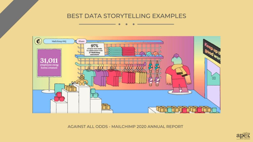
Source – Mailchimp 2020 Annual Report
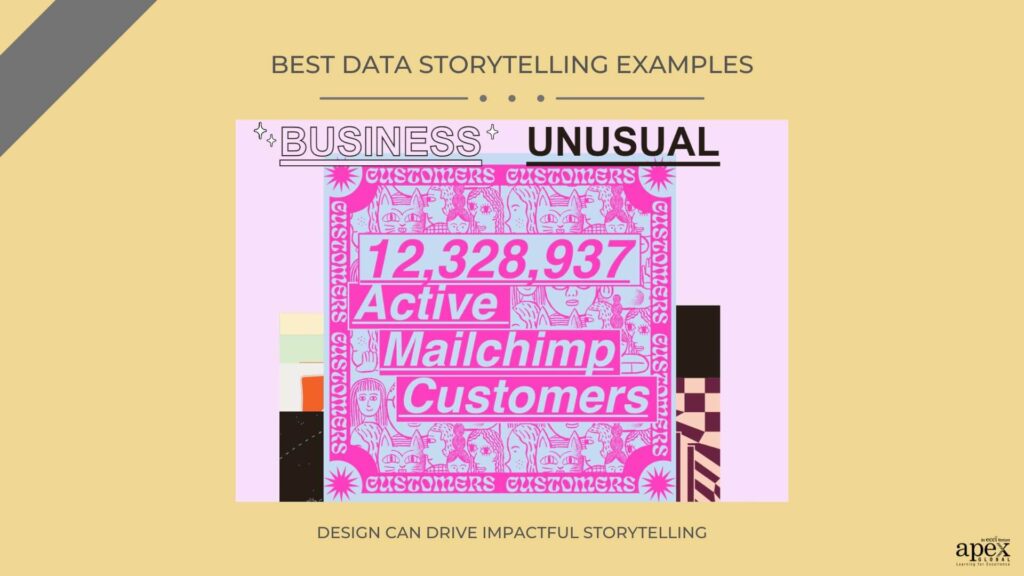
8. Design can drive impactful storytelling
Mailchimp’s annual reports prove that data-driven reports do not have to be boring. The 2019 “ Business Unusual “ report is constructed around a visual narrative. This proves that a creative design can drive the entire data story. The report makes use of contrast and hierarchy to create emphasis on key points. This makes it easy for readers to quickly identify the most relevant information.
Key Takeaway – In detailed data stories, random interactive elements can add an x-factor. It makes your viewers feel part of the storytelling action. In this Mailchimp report, interactive timelines allow readers to explore the year’s milestones by themselves and discover insights into Mailchimp’s activities.
Source – Mailchimp 2019 Annual Report
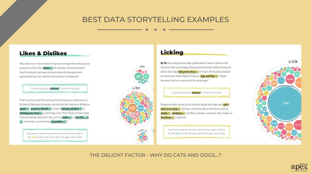
9. The delight factor – Why Do Cats and Dogs…?
Why do cats and dogs, showcase how a seemingly mundane topic can be presented in a visually appealing and emotionally engaging way? The project explores a warm topic- the difference between cats and dogs. To add an even more emotional element to their data storytelling, Bremer and Google Trends also compare the number of cat-related searches versus dog-related searches over the years. This comparison reveals a trend of declining searches for cats versus increasing searches for dogs. Even the color palette is carefully chosen to evoke a sense of harmony and balance. The typography is kept simple and legible.
Key takeaway – Focus on creating emotional value. In this example, the delight factor stems from the choice of a very relatable topic. Further, the visual structure invites the readers to learn about the topic without feeling as if they are only getting raw numbers.
Source – Nadieh Bremer and Google Trends
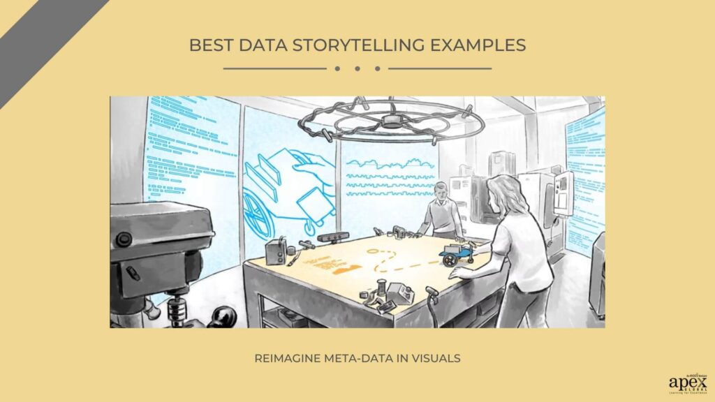
10. Reimagine meta-data in visuals
At the core of Seeing Spaces is the concept of flow. Brett Victor uses data visualizations to create a sense of movement and direction. Using color, shapes, and lines, he creates a dynamic environment that encourages viewers to explore and discover patterns in the data. He incorporates basic typography and grid-based layouts to organize information. He also utilizes sound to evoke a sense of tension and excitement as viewers navigate through the story.
Key takeaway – A successful conclusion is equally important for a compelling story structure. For example, Victor might present a series of bar graphs to illustrate the rise or decline of certain variables over time. However, he uses stories to reveal trends and patterns in the data to reveal why the data is important to the viewers.
Source – Seeing Spaces
11. Examining Inequality – Gates Foundation
The Gates Foundation’s Examining Inequality report uses data storytelling to educate and inspire action. The report takes a deep dive into global inequality and its effects on different demographics. The use of graphics helps the reader better understand the big picture. For example, the infographic at the beginning of the report uses bars and colors to compare income inequality between countries. The Gates Foundation also utilizes stories from individuals to bring the report to life. These stories provide a human face to a complex problem.
Key Takeaway – When creating data-driven presentations, don’t lose sight of the final purpose of your story. If you want your viewers to be shocked, inspired, or compelled into taking an action, you have to spell it out. In this example, the report adds a list of actions and invites viewers to explore more global data indicators on the site.
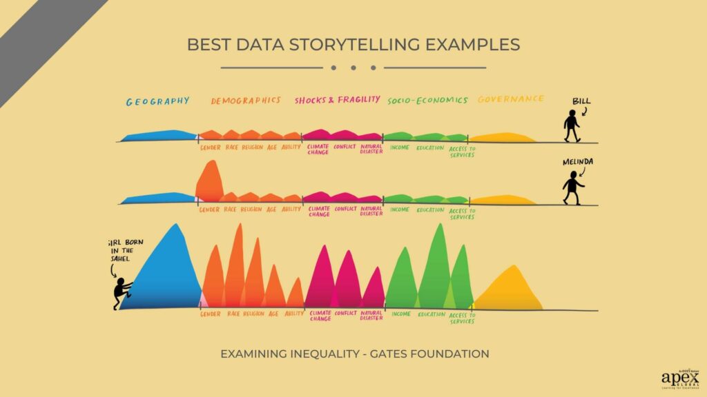
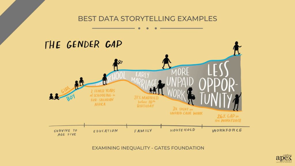
Source – The Gates Foundation
12. Relatable Data Storytelling
This piece explains the heartbreaking toll that Covid-19 has had on the U.S. population. At its core, this piece employs two key elements of data storytelling: visualizing data and writing a compelling narrative. Maps, bar graphs, and pie charts explain the death toll for each state at a glance. In addition, the visuals feature intelligent prose that helps to illustrate the loss of life in a more human and personal way.
Key Takeaway – Focus on the narrative that goes along with your data visualization. The narrative doesn’t always have to be prose. Carefully placed titles and captions can be just as effective.
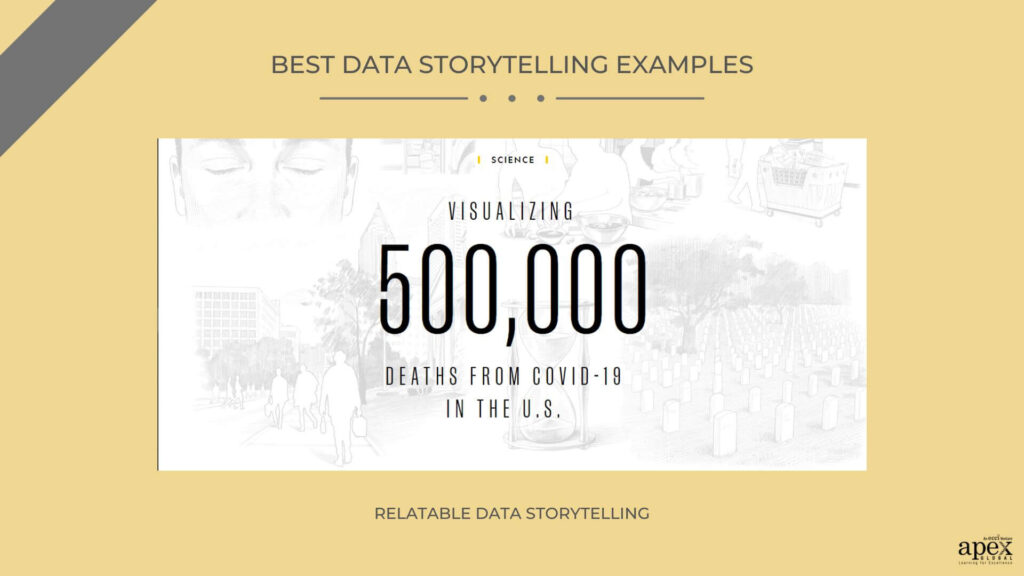
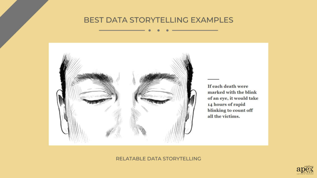
Source – VISUALIZING 500,000 DEATHS FROM COVID-19 IN THE U.S.
13. What’s your message? – What we eat makes a difference
This initiative provides valuable insights into our relationship with the ocean. How can the choices we make around seafood have positive or negative impacts on marine life? It uses straightforward graphics to draw in readers without intimidating them with large amounts of data. The minimalistic design just puts undiluted focus on the message.
Key Takeaway – If you have a clear core message, don’t clutter it with visual elements. Good data storytelling will broadcast the core message right off the bat. The graphics are help to underline or highlight the message.
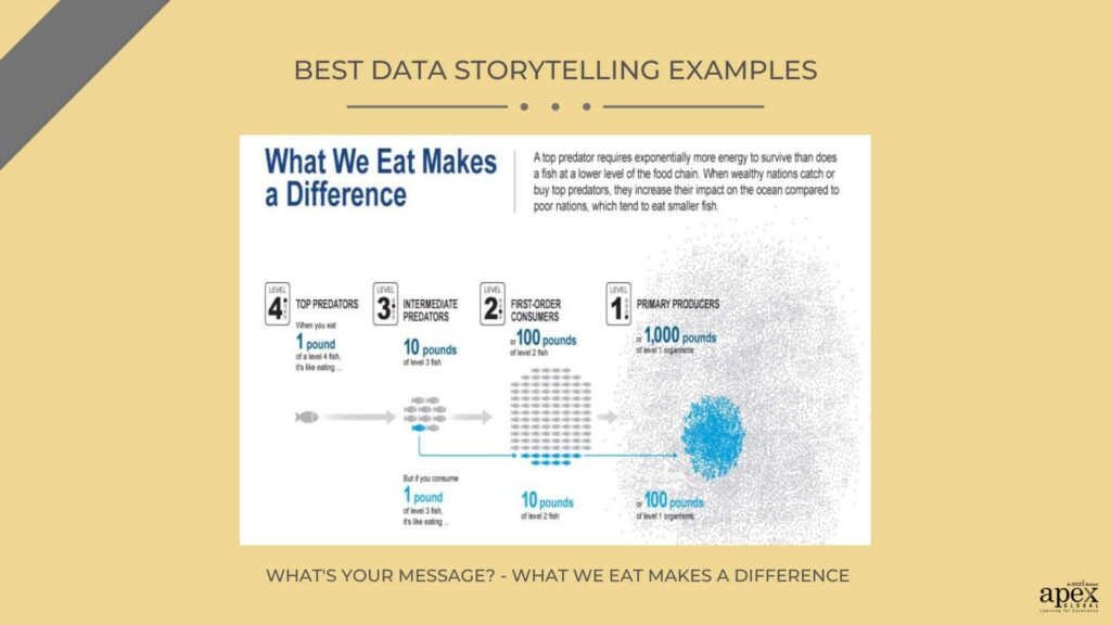
Source – Mariel Furlong and Alejandro Tumas
14. Story at a glance – As the word turns
One key element of Uberti’s data storytelling was the intelligent use of visuals. Every visual element stands alone as a data story in itself. For instance, he created an animation of the rise and fall of the usage of words over time. He opted for a circular chart design to break the monotony of data design in the story.
Key takeaway – Use empathy to increase engagement. For instance, Uberti used anecdotes to explain why certain words became popular or declined in popularity. He also used metaphors to help readers visualize what was happening with the data. For example, he compared the rise and fall of words to the back and forth of a tennis match.
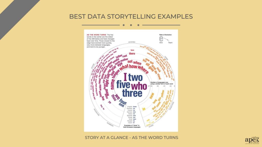
Source – Oliver Uberti
15. Creativity with public data set – Cicadas, A Data Story
Brewer uses several elements to capture the emergence of Brood X cicadas and its impact on nature and communities. The publication includes a range of visuals, from historic photos of cicada swarms to more recent aerial shots of Brood X emergence.
Brewer also uses compelling statistics to help support her narrative. She references data from the US Department of Agriculture to provide context and a deeper understanding of the scale of the event. Bold Colours and large font size make it easy to follow the data story.
Key takeaway – Make your story design scannable for a lasting impression. In this instance, the story design uses color blocks for great effect. It is super easy to pick up the priority factors just by scrolling down once.
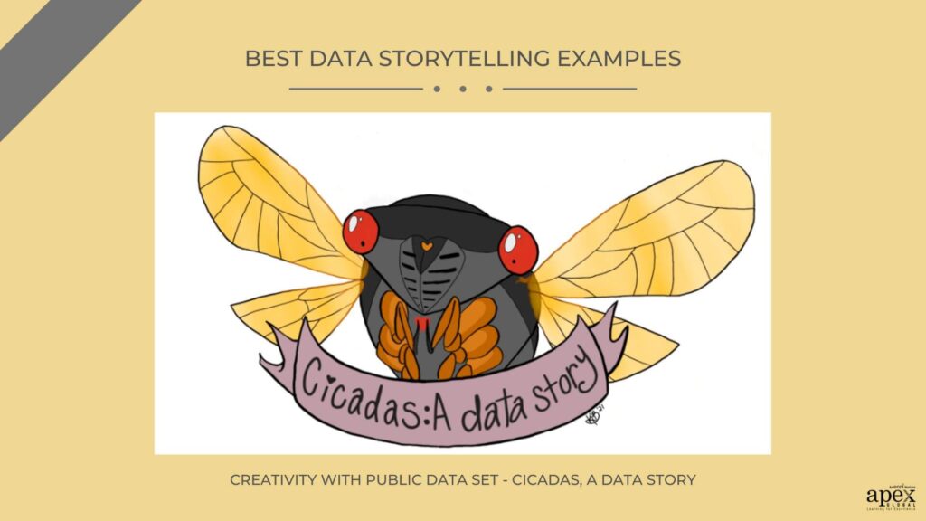
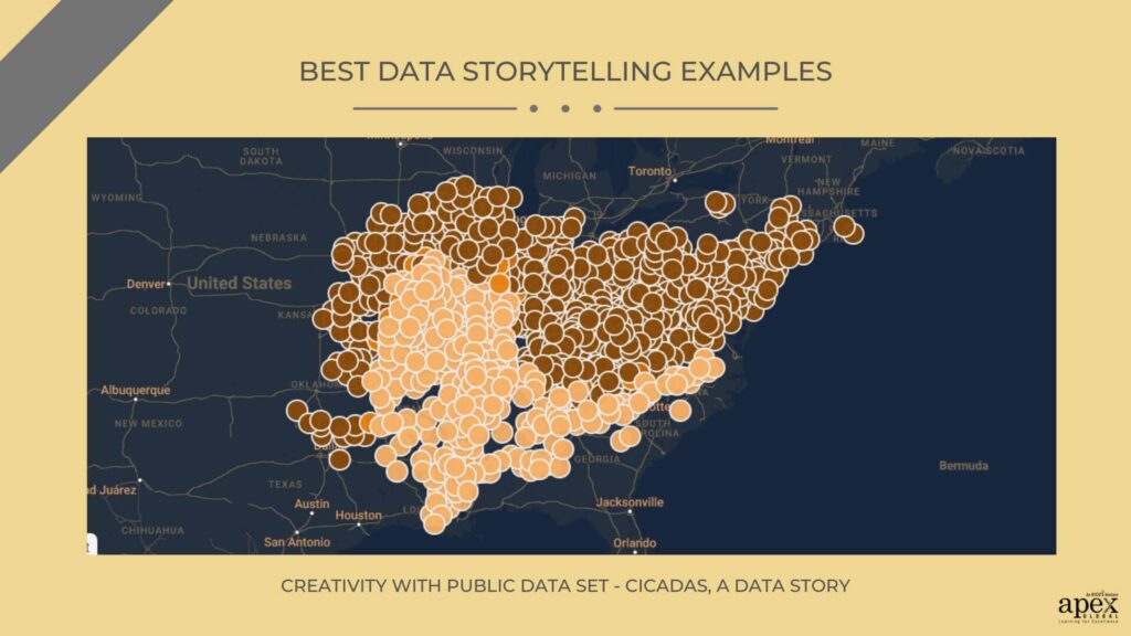
Source – Kayla Brewer
16. Box Office Mojo – Chit Chart
Choose elements that work together to provide a comprehensive view of the data. A big box of popcorn is an immediate connection to movie theatres. It is converted into a clean bar graph that shows all of the data variables at a glance. You can check out pertinent box office details of the top-grossing movies of all time.
Key Takeaway – Don’t get lost in the data. Whenever possible finish a data story without cluttering it. If you can pick one visual element and still cover your story, that’s great!
Source – Chit Chart
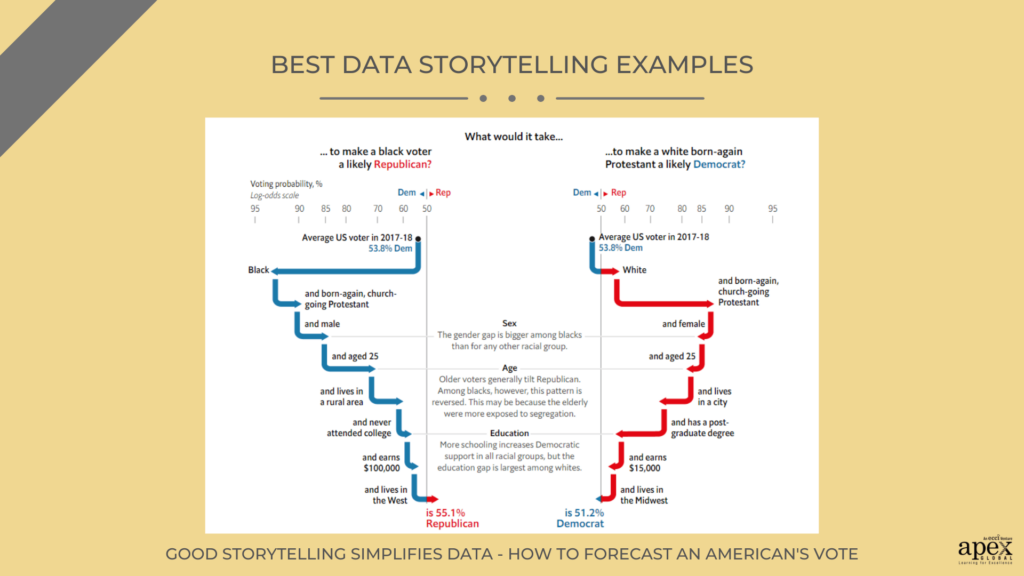
17. Good storytelling simplifies data – How to forecast an American’s vote
Every graphic in this piece is designed to add another layer to the data storytelling efforts. Interactive charts allow the readers to explore the implications of the data. Comparison charts provide insights that are applicable even outside the context of the presentation. A classic color palette and clean lines keep the article minimalistic.
Key Takeaway – In data storytelling, brevity is your friend. Ruthlessly simplify the data and keep it to the point. If the data is large, fall back on simple design to keep from overwhelming your readers.
Source – The Economist
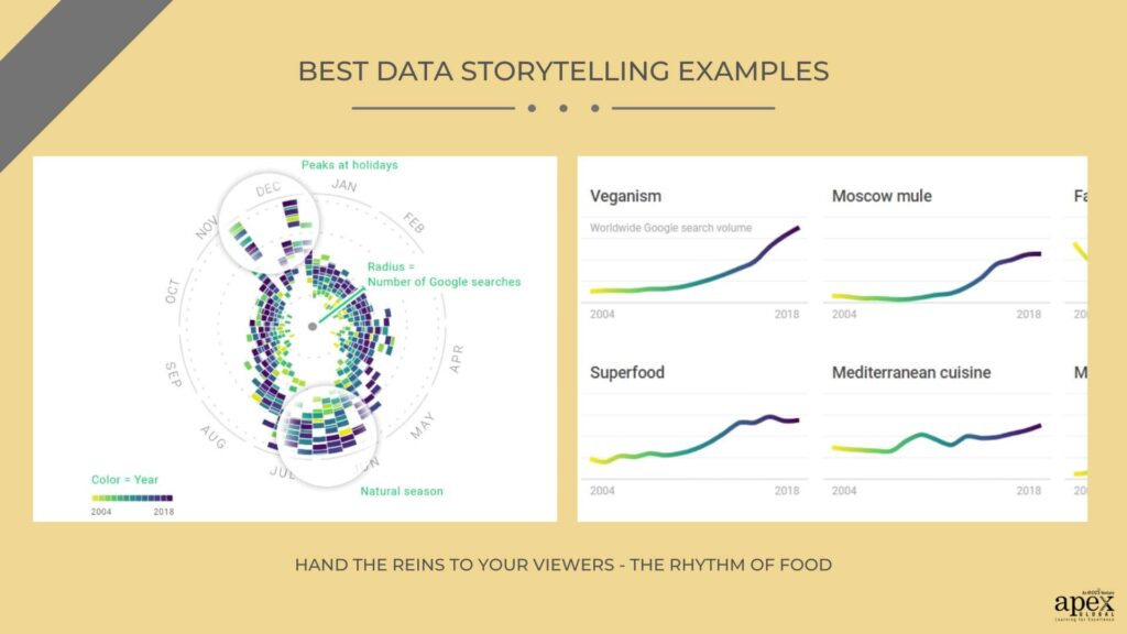
18. Hand the reins to your viewers – The Rhythm of Food
In the Rhythm of Food, Stefaner tells the story of the global food system. For this, uses data from google search interests to check key food trends over the years. He has plotted this data on an interactive year clock. The sheer volume of data could have overwhelmed the overall story but the visual design prevents this. The dynamic color choices and large text break strategically space out the visuals. The text breaks are also direct questions or calls to action. These literally invite the readers to dig into the data.
Key takeaway – Your data should be the leading character of the story. However, the information design is a strong supporting cast. Choose a few design elements but they should enhance the power of the data.
Source – Moritz Stefaner
19. No way Norway – Chit Chart
The chart uses visuals to quickly communicate information about the number of whales killed in Norwegian waters each year. This is a heartbreaking topic. The image of the cut-up whale sets this point across immediately. Each segment of the whale then represents a data cluster. Breaking down the data into smaller segments shows the impact that various countries have had on whale hunting. The story communicates a powerful message about the effects of human actions on our environment.
Key Takeaway – When picking design elements generously think about the symbolism of your design. For instance, the title design of this chart has the words “No Way Norway” arranged around a small design of a whale’s tail. On a closer look, you will realize the arrow has been shaped like a harpoon going through the diving whale. Even without the rest of the data, this simple graphic symbolically conveys the message of the chart.
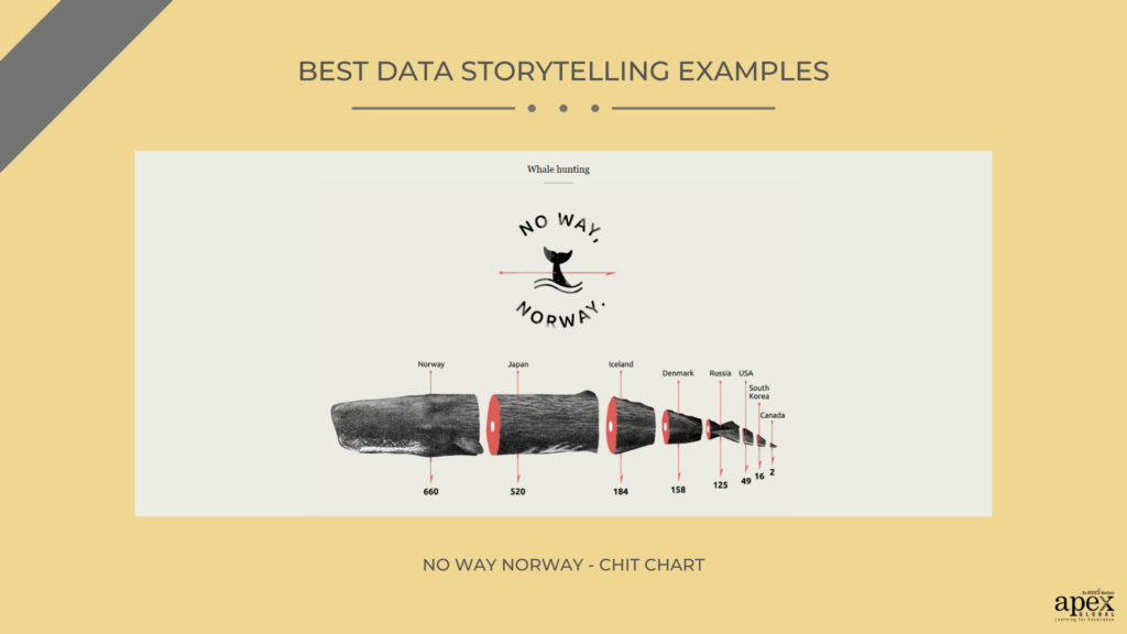
Source – Chit Chart
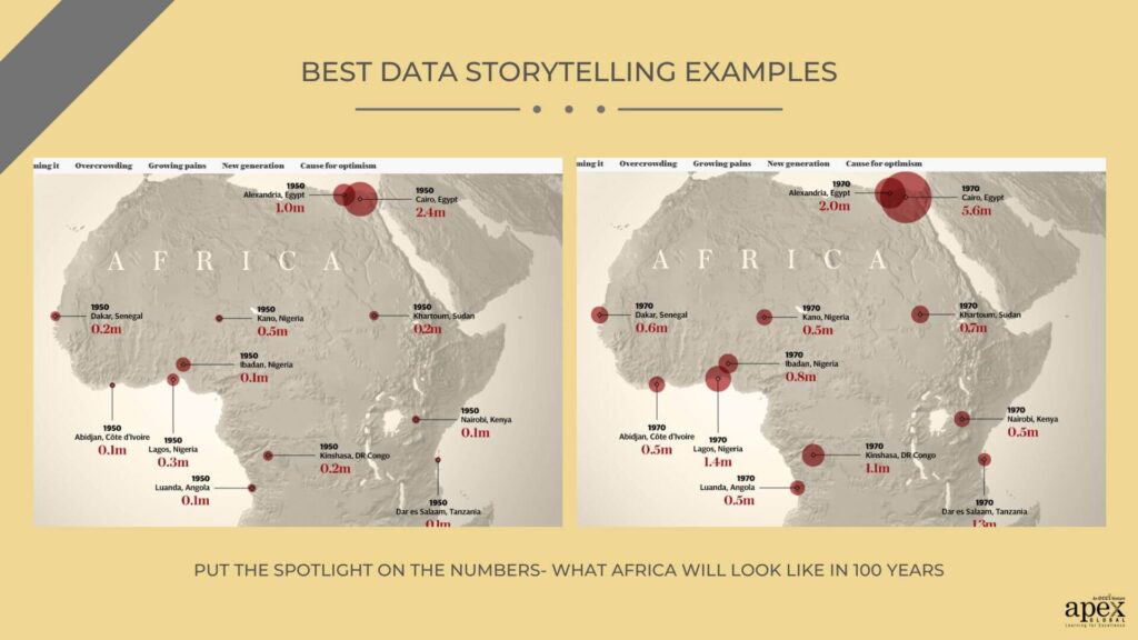
20. Put the spotlight on the numbers- What Africa will look like in 100 years
Through data storytelling, they explore the potential changes that Africa might experience over the next 100 years. While this is an exciting and thought-provoking glimpse into the future, the wide timeline means a higher volume of data. To deal with this, they provide clear visualizations to explain the data. Secondly, the conversational tone makes the narrative more reader-friendly. Finally, the article provides readers with plenty of background information on the topic. Including historical context and current trends helps to bring the data to life.
Key Takeaway – Effective delivery is one of the key elements of data storytelling. For high-volume data stories, it is important to simplify the narrative. Direct messages, short sentences, and a conversational tone work like a charm for this purpose.
Source – The Telegraph
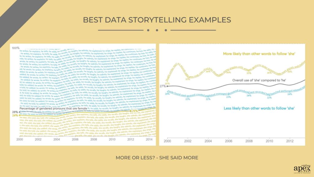
21. More or Less? – She Said More
The first element of data storytelling is to have clear objectives. In the case of She Said More, this meant understanding the issue of gender inequality in the UK’s entrepreneurship landscape. Gender imbalance is explored through a comparison of the frequency of gender pronouns mentioned in the leading publications of the country. The visual is a litany of these gender pronouns arranged according to their percentage of appearance. Interestingly, the designers have refrained from using stereotypical pink to represent female pronouns. Instead, the golden color depicts females while the male pronouns are in blue.
Key Takeaway – Don’t tell a one-dimensional story. For instance, Nesta also emphasized inspiring outcomes as part of its data storytelling. The report highlighted both the challenges female entrepreneurs face and the progress that has been made so far. This gave readers hope that the gender gap can be overcome with the right policies in place.
Source – Nesta
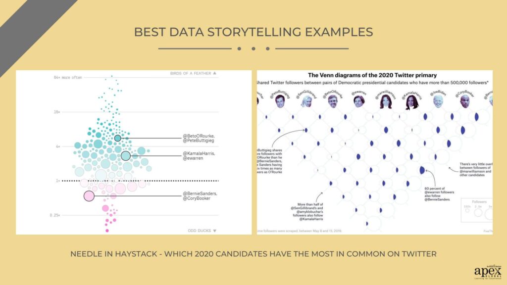
22. Needle in Haystack – Which 2020 Candidates Have the Most in Common on Twitter
Five Thirty Eight smartly uses simplified data visualizations to compare 20 million data entries. Each circle represents a candidate. The size of the circle indicates the relative frequency of the tweets for that candidate. Additionally, arrows indicate the similarity between the two candidates. The thickness of the arrow indicates the degree of similarity. This makes it easy to see which candidates have more in common at a single glance.
Key takeaway – Classic colors can give a timeless and modern feel to the visuals. For instance, the topic for this chart is dated for a particular year. But the data reference will remain relevant for future political researchers. Therefore the use of the classic visual design is ideal here.
Source – Five Thirty-Eight
Honorary Mentions
There are also some honorary mentions that were just too good to resist.
- The Big [ Censored ] Theory by Manyun Zou – Screenshots and dialogue excerpts are arranged in neat timelines to present how China exclusively censors global broadcasts in the country.
- The Jews of Lebanon by The Arab News – A heart-wrenching minority report that uses data storytelling to outline the fading memories of the dwindling Jewish community in the country.
- 30 years of American Anxieties by The Pudding– 20,000 ” Dear Abby” letters are explored to create a data story of the issues that Americans worry about most.
How do you learn data storytelling?
If you’re looking to tell a story with data and aren’t sure how to proceed, here are the four key steps to follow.
- Learn the Basics: Understand how different visualizations can help to improve how you communicate data-driven stories.
- Get Hands-On Experience: Explore different tools like Tableau, PowerBI or Excel.
- Learn from Examples: Look at these existing examples of data storytelling in action.
- Share Your Work: Look for communities where you can receive feedback on your work
You can enroll in professional data storytelling courses conducted by certified instructors. Apex Global Learning provides a 2 days intensive Live Virtual Training program on data storytelling. The course is uniquely designed for a combination of a theoretical and hands-on approach to data storytelling essentials. Check out the course here!
Unlock the potential of data science and imagine a world where every customer interaction is uniquely tailored. Join us at the “Data Science for Personalized Customer Journeys” Xposium and dive into the art of predictive analytics and machine learning. Discover how data-driven insights can reshape customer experiences. Ready to leave generic interactions behind? Explore the Xposium here and be part of the future of personalization. Your customers will thank you!
Conclusion
Once you’ve analyzed the data storytelling examples we’ve collected, you can begin to apply the lessons to your own data visualizations. When crafting your own data stories, be sure to keep your audience in mind. Use visuals that make the most sense for them. For example, consider using a timeline to show key milestones if you’re presenting a story about a new product launch. Similarly, for sensitive topics choose visuals with emotional symbolism. But above all, learn to enjoy the process of creating data-driven stories that encourage immediate reactions.