Ever feel like you’re just spinning your wheels with data? When you can’t find a story, data can feel overwhelming and unhelpful. Data storytelling is a way to connect data insights to a specific problem or goal. The intent is to turn these insights into something tangible and compelling. With this blog post, we have composed a blueprint of data storytelling basics. What are the essential elements of data storytelling? How to uncover insights to make up a good story? And once you find a good story, how can you create a data-driven narrative? Let’s explore!
What you'll find in this article
- 1 Why do you need to tell a story with your data?
- 2 How to craft a good data story?
- 3 The 4 elements of data storytelling
- 4 Data Storytelling Vs. Data Visualization- Key Differences
- 5 Find the right story in your Data
- 6 What are some simple data storytelling techniques?
- 7 Challenges to designing a good data story
- 8 How to become an expert data storyteller
- 9 Final Thoughts
Why do you need to tell a story with your data?
Data is meant to be consumed by humans. Humans like stories. Stories have a beginning, a middle, and an end. They convey emotion and build empathy. In this age of data overload, data that tells a story can break through, change minds, and push agendas.
So why tell a story with data?
1. The data is often too complicated to understand, so a story simplifies it. For instance, in this particular study AD Cropper has explored how the use of scientific storytelling helps improve the communication and connection established with complex data.
2. Stories engage and emotionally connect with people, while data can often disconnect.
3. A story provides an explanation of what happened and why it matters. Meanwhile, data just gives facts without context. Expert guidelines for information design state that you should work to minimize “chart junk” The term refers to unnecessary visualizations, charts, and bar graphs. However, this study found that visual embellishments that follow a narrative have a completely different outcome. A visualization that follows a story can significantly increase the interpretation accuracy and the long-term recall value of the information.
4. A story provides an emotional context and can motivate change.
5. Stories give you a perspective that you may have never considered before, whereas data does not. Research has proved that the implementation of narrative visualization can significantly improve business communication. This is particularly relevant when you have to communicate a complex topic in an accessible manner.
6. Persuasive stories can motivate change or actions, while data cannot.
7. Finally, storytelling humanizes the story and the topic at hand. Just presenting facts leaves it unemotional or distant.
How to craft a good data story?
Crafting a data story is like any other form of writing. It needs a strong opening, a clear focus, and a compelling conclusion. OK, but what makes it a good data story? There are 3 things:
1. The audience: Who is your audience? How does this topic affect them? What do they care about?
2. The data: What data will you use? Where did you find it? Is it a big deal that there’s only one data point?
3. The format: Will you use charts, graphs, or something else to illustrate your story? Using plenty of visuals brings the data alive for readers.
The 4 elements of data storytelling
- Character: The character in a data story should be the focus of the story. It can be any kind of person, company, or entity. It is important to create a character that will be relatable to your audience so they can make connections and learn from the story. To successfully set a relatable character for your story, first, understand your audience. Ask yourself questions such as: What kind of people are in my target audience? What are their needs and concerns? How can I use data to tell a story that speaks to them? Knowing the answers to these questions will help you craft a narrative that connects with your audience on an emotional level. For example, in the following data story, the focus is on Britons who believe in alien encounters. Therefore, the obvious choice for the main character element of the story is a spaceship. The graduated beam of the spaceship is used to depict the statistical information.
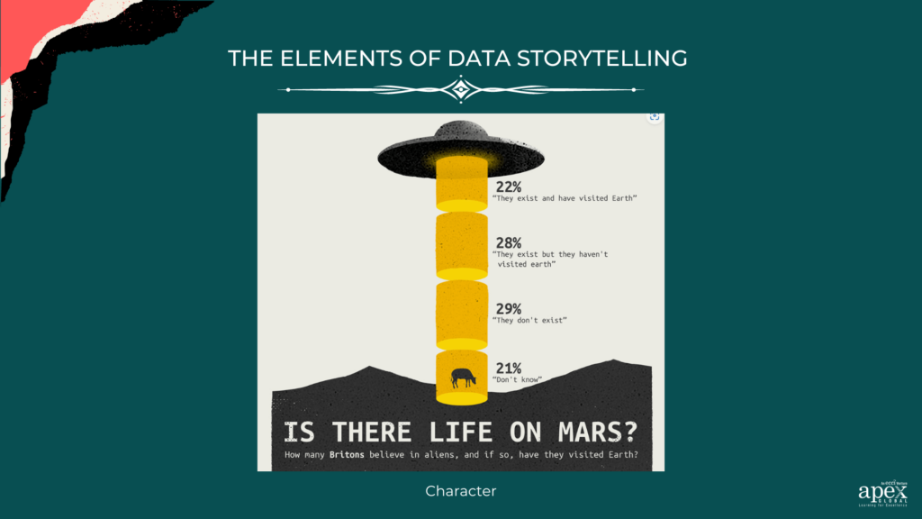
Source: Chitchart
- Setting: The setting of your data story is the context in which it takes place. It could include the time frame, location, or industry in which the story takes place. This can range from past events or long-term trends to current market conditions or emerging technology. For example, in the following visual you are telling a story about sex-related issues that concerned Americans during the 1980s. You need to provide information about the issues and when they were most important. Providing this information will allow your audience to understand how the growth has been impacted by other factors such as economic conditions, political changes, or generational changes.
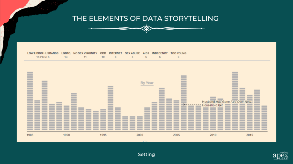
Source: The Pudding
- Conflict: Conflict is a key element of storytelling, and it is necessary to keep your audience engaged in your data story. Essentially you are creating curiosity gaps. The curiosity gap is the space between the information that we know and the information that is withheld. The conflict should be relevant to the topic at hand and should provide an opportunity for your audience to learn something from the story. You can use industry standards or compare one metric over time to show the differences in performance or growth. In addition to this, you can also use contrasting data points to show the importance of different variables, such as income levels and geographic location. The goal is to use these conflicting pieces of information to highlight the most meaningful aspects of your data story.
- AHA Moment: This is the point in your data story when something new or unexpected is revealed. It is an opportunity for the audience to pause and reflect on the implications of the data before moving on. It’s important to ensure that this moment resonates with your audience and encourages them to think critically about the data.
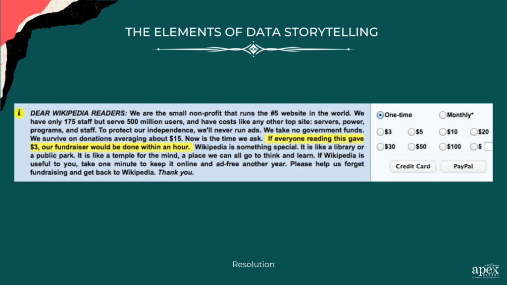
- Resolution: The resolution is the culmination of your data story and should provide a clear conclusion or call to action. Remember, you’re not just delivering a dataset — you’re giving insights into what drives people’s decisions! How you can get your data story told, on the ‘human scale’ that resonates with all? For starters, focus on the impact of the data on the individual level. Draw vivid mental pictures that tap into emotions. It should resonate with the people who are affected by the trends & decisions we are making based on those data sets. For example, Wikipedia’s fund-raising campaigns use this principle incredibly well.
The message uses plain language. It includes the emotional (a temple for the mind) and the rational factor (we have 175 staff but serve over 500 million users). Through the use of the human scale principle, the platform presented viewers with a remarkable visualization of the impact that any single donation could have. the message proclaimed that if everyone reading the message donated just the price of a cup of coffee to support Wikipedia, the platform would cover their yearly expenses within an hour. It may seem like a drop in the ocean, but who knew that could make such a big difference?
Bottom line? Don’t be afraid to add humor and a personal touch. This makes all the difference when it comes to telling effective, compelling stories with your data.
Data Storytelling Vs. Data Visualization- Key Differences
Data visualization is about understanding the context and trends in the data. This can be done by looking at charts and graphs. It is a powerful way to understand a data set quickly. But it can lack the deeper understanding that comes with engaging storytelling.
Data storytelling, on the other hand, is all about interpreting the data and finding meaning within it. It is more than just presenting the facts. It is about extracting insights and connecting them to an underlying narrative. Data storytelling allows us to make sense of complex data sets. Further, it helps us to understand why certain trends or behaviors are occurring. Data storytelling requires more time and effort. However, it can convey the story behind the data in a more engaging way.
Find the right story in your Data
The first step is to identify the story you want to tell. To do this, you must understand the data you are working with and look for patterns, insights, and relationships within it. Once you have a good understanding of your data, you can start to look for patterns and trends in the data. You can use analytical techniques to look for hidden insights in your data. Also, consider the context of your data – who created it and why it exists. This will give you a better idea of what stories you might be able to tell from the data.
The two main analysis techniques that can reveal data insights include
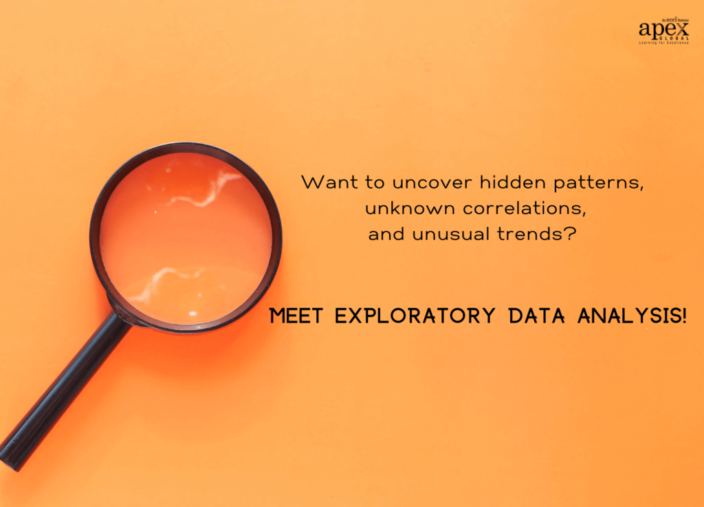
Exploratory Vs. Explanatory Data Analysis
Exploratory analysis uses visual methods to discover patterns and relationships in the data. It includes things like data cleaning, creating plots and graphs, performing basic statistical tests, and identifying correlations. This type of analysis is often used to identify potential questions that may need further investigation. Sounds like a secret code from an exciting detective novel! Tune in if you want to become the Sherlock Holmes of data analysis!
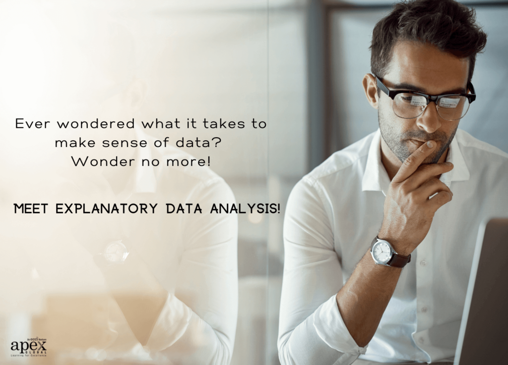
Explanatory analysis involves deeper dives into the data to explain or predict a particular outcome. It relies heavily on statistical models, such as linear regression, logistic regression, or time series analysis. Unlike exploratory analysis, explanatory analysis requires a clear research question or hypothesis to be tested. Through this type of analysis, you can test the strength of the relationship between two variables. And unlike regular storytelling, your audience will thank you when they get a clearer understanding of what you are trying to say.
What are some simple data storytelling techniques?
1. Use Imagery: Visuals are often the best way to tell a data story. It can be used to successfully enhance the elements of data storytelling within your story. Not only can they help to simplify complex data, but they also capture attention and engage the senses. Use visuals like charts, graphs, infographics, maps, and pictures to provide a snapshot of the data in a creative way.
2. Simplify your Message: Make sure that you keep your data story simple. Don’t overcomplicate it by focusing on too many details or using overly complicated language. The key is to explain your data in a concise manner, highlighting the main points without overwhelming your audience.
3. Use Metaphors: Metaphors can be an effective way to draw comparisons between different sets of data. They can also help to make complex topics easier to understand and make connections that would not have been possible without them.
4. Tell a Narrative: Stories are powerful tools for communicating data. By adding a narrative element, you can give your data story a compelling emotional context. This will also help to make it more memorable and ensure that your audience is engaged throughout the entire process.
5. Make It Interactive: Interactivity is key for making data stories engaging and memorable. Incorporate interactive elements into your presentation, such as polls or quizzes, to further engage your audience and encourage them to explore the data further.
6. Create an Experience: Data storytelling isn’t just about communicating facts and figures; it’s about creating an experience that people can relate to and be inspired by. Focus on making your presentation immersive and thought-provoking so that it resonates with your audience and leaves a lasting impression.
7. Human Touch: Personalize the story. Share anecdotes, quotes, case studies, or personal stories related to the data to help readers relate to the information more easily.
8. Leave room for interpretation: The goal of a data story should be to encourage readers to explore their own conclusions from the data, rather than spoon-feeding them one specific conclusion. Encourage your audience to think critically and draw their own conclusions by leaving room for interpretation.
Challenges to designing a good data story
Data storytelling can be a complex process that requires thoughtful consideration and creative insights.
Story Presentation – One of the biggest challenges in designing a successful data story is deciding which data points to include, how to organize them, and how to present the findings. The key is to focus on what’s important and tell a story without drowning the audience in data.
Clarity- Another challenge is that when dealing with a lot of data, it can be difficult to get a clear picture of what’s going on. It is important to take time to understand the data thoroughly and ask questions to gain more insight into the story you are trying to tell.
Story Consolidation- You also need to ensure you have the right skills and resources to effectively analyze the data and communicate your findings. Data storytelling involves a variety of disciplines including analytics, data visualization, and storytelling. It is important to understand how each piece of the puzzle fits together so that your story is as effective as possible.
Relatability – Finally, understanding the audience and their level of knowledge is essential for effective data storytelling. You need to ensure that you are presenting the data in a way that will be accessible to your audience. This may require some creativity in terms of data visualization or presentation techniques.
Trying to sift through unstructured data with nothing but a dull table knife to break the knots and build something useful with it. These are all too common and somewhat real obstacles if we’re honest.
So if you’re a fellow data storyteller who loves the challenge, then this one is for you! Let’s join forces and turn all those roadblocks into inspiring, captivating data stories!
How to become an expert data storyteller
Forrester Consulting conducted a survey of over 2000 managers and corporate employees to understand how companies value the need for data literacy.
The results revealed that 82% of corporate leaders expect employees to have fundamental data literacy. 79% of team leaders are actually working to make related programs accessible to their teams. However, only 40% of employees accept that they have access to upskilling programs for data literacy in their companies.
As you can see there is a significant gap between the organizational skilling programs and the current job requirements in major companies.
While there are lots of self-directed learning resources available online, such as ebooks and tutorials, taking a class or course gives you the opportunity to learn from industry experts and get feedback on your work. You’ll also learn specific skills, such as how to use data visualization and data mining software, which can be invaluable in your career.
Our intensive data storytelling course by Apex Global Learning is here to help! It covers all the basics — data cleaning, data visualization, and storytelling techniques. It is designed to help you leverage data as a powerful medium for decision-making and analysis. So, get out there and take control of the story your data tells about you!
In addition to formal courses and training sessions, look for other ways to stay on top of industry trends. Join a professional organization or attend conferences related to data storytelling to keep up with the latest tools, techniques, and best practices. Also, follow thought leaders in the field on social media for inspiration and new ideas.
Finally, practice makes perfect! As with any skill, becoming an expert data storyteller takes dedication and hard work. Experiment with different techniques, various elements of data storytelling and use tools like Tableau and Power BI to create visualizations that will make your stories more engaging. By reading up on the principles of data storytelling, immersing yourself in the field, and putting your skills into practice, you can become an expert data storyteller in no time.
Final Thoughts
Do numbers tell a story? We say YES! We live in a digital world and are more used to relying on data to shape our understanding and decision-making. A well-told data story can be used to grab attention, create a connection with an audience, and drive home a point. As more organizations recognize the importance of visualizing data to reveal patterns, trends, and correlations, they also begin to realize that telling stories with data requires some level of creativity. When you can effectively bring a dataset to life with a compelling narrative, you have the power to influence business decisions and drive organizational growth.