Data is more than just numbers; it’s a story waiting to be visualized. In a world drowning in information, data visualizations are our guiding stars. Remember, ‘The best story is one that’s told well.’ These data visualization examples are primed to illustrate precisely this fact.
In our data-driven world, where an astounding 2.5 quintillion bytes of data are generated daily, the challenge is not the scarcity of information but the overwhelming abundance. To navigate this sea of data, data visualization emerges as the lighthouse, helping us make sense of complex information and revealing patterns, trends, and stories hidden within. In this article, we’ll explore 15 real-life data visualization examples that showcase the diverse ways in which data can be transformed into insightful visuals. In each visual, there’s a lesson—data isn’t dry; it’s a vibrant tapestry.
What you'll find in this article
- 1 1. Facebook Likes Map
- 2 2. Spotify Music Map
- 3 3. New Chart of History
- 4 4. The History of the World Since 1300 AD
- 5 5. Google Analytics Dashboard
- 6 6. Blockchain Technology World Visualization
- 7 7. Mental Health User Journey Experience Map
- 8 8. Microsoft Power BI Data Visualization Examples
- 9 9. NASA Mars Exploration Program Dashboards
- 10 10. Water Consumption
- 11 11. Plastic Waste Pollution
- 12 12. Icebergs and Weather Change
- 13 13. Visualizing Pandemic History
- 14 14. Fossil Fuels
- 15 15. Help Businesses Understand Complex Issues
- 16 Empowering Change Through Data Visualization
1. Facebook Likes Map
Real-life Example: The Facebook Likes Map harnesses personal data, location tracking, and interests to visually represent a user’s preferences. This dynamic map not only displays favorite locations but also employs heatmaps to showcase the intensity of preferences across different regions.
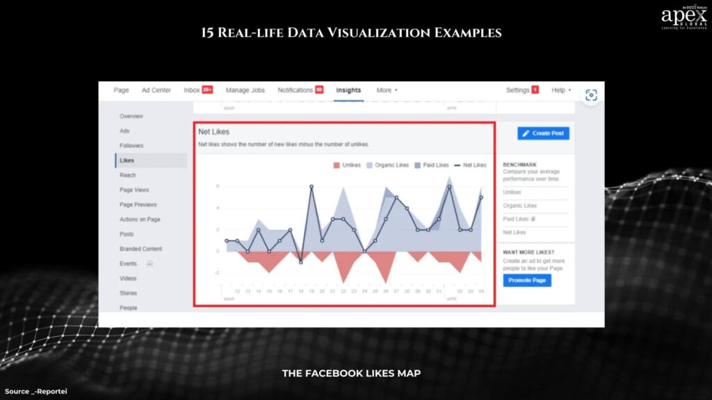
What You Can Learn: Interactive mapping of personal preferences provides an engaging way for users to understand and reflect on their own data. The incorporation of heatmaps enhances the visualization’s depth, allowing for nuanced insights into user preferences across geographical areas.
2. Spotify Music Map
Real-life Example: Spotify’s Music Map leverages its vast database to illustrate music popularity globally. Users can explore trends by country, genre, and year, creating an interactive and visually rich representation of musical preferences worldwide.
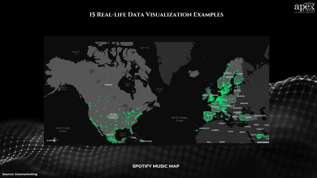
What You Can Learn: This example demonstrates how data visualization can transform complex data, such as music consumption patterns, into an accessible and visually appealing format. It highlights the importance of interactivity in engaging users and making the exploration of data an enjoyable experience.
3. New Chart of History
Real-life Example: Building upon the success of the “Chart of Biography,” Priestley introduced the “New Chart of History.” This innovative timeline not only showcases the concurrent existence of major empires and cultures but takes visualization to new heights by incorporating color, size, and a creative y-axis of location. The result is a visually rich narrative that captivates and informs.
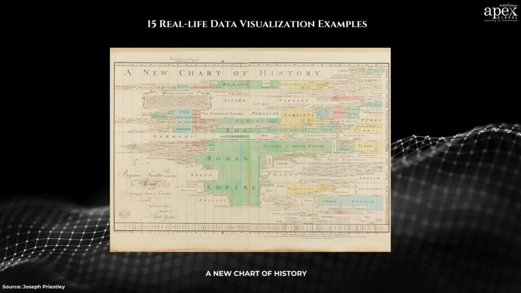
What You Can Learn: The “New Chart of History” exemplifies Priestley’s commitment to pushing the boundaries of visualization techniques. By introducing elements like color and size, Priestley adds layers of complexity to the timeline, creating a visually engaging and informative tool. The incorporation of a creative y-axis of location adds a spatial dimension, enriching the understanding of historical events.
4. The History of the World Since 1300 AD
Real-life Example: This visualization provides a comprehensive journey through world history since 1300 AD. Offering timelines for specific events, social movements, and changes in population size, users can interactively explore historical trends and gain insights into different eras.
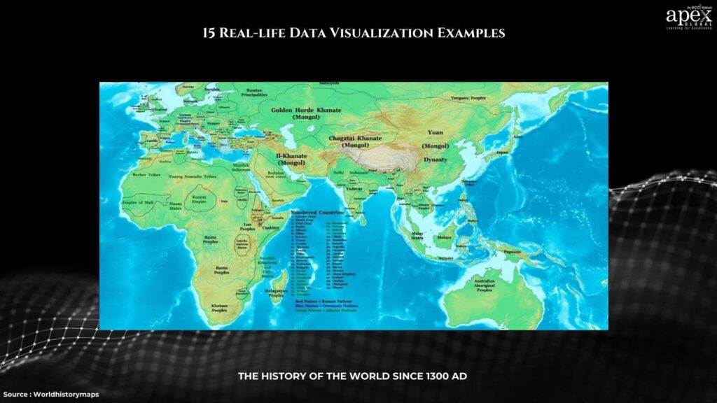
What You Can Learn: Interactive features empower users to engage with historical data actively. By allowing users to filter information by categories or decades, the visualization becomes a versatile tool for exploring and understanding complex historical narratives.
5. Google Analytics Dashboard
Real-life Example: Google Analytics Dashboard furnishes detailed statistics on website traffic, highlighting popular sections and user behaviors. Its customizable nature ensures that users can tailor the dashboard to focus on specific aspects, improving overall website performance.
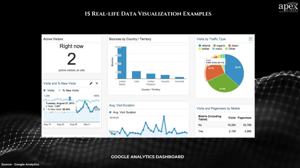
What You Can Learn: Customization is key in data visualizations, as seen in the Google Analytics Dashboard. It provides a tailored experience, allowing users to concentrate on the metrics that matter most to them, facilitating informed decision-making for website optimization.
6. Blockchain Technology World Visualization
Real-life Example: This visualization illustrates blockchain transactions, emphasizing the technology’s inherent immutability. The interconnected blocks, secured through cryptography, showcase the unalterable nature of recorded data.
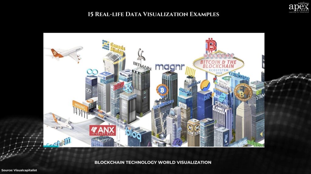
What You Can Learn: Emphasizing unique features, such as immutability, adds depth to data visualizations. This example underscores the blockchain’s resilience against retroactive data modifications, contributing to a better understanding of its core principles.
7. Mental Health User Journey Experience Map
Real-life Example: Focusing on mental health, this interactive map enables users to explore the relationship between brain sections and specific symptoms. It provides valuable information on symptom development, warning signs, prevalence, and effective treatments.
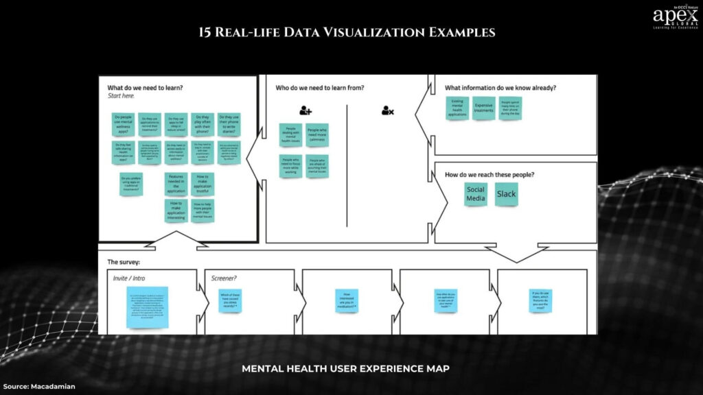
What You Can Learn: Data visualizations addressing sensitive topics, like mental health, offer an excellent starting point for education and awareness. The interactive map format encourages exploration and fosters a deeper understanding of the complexities surrounding mental health.
8. Microsoft Power BI Data Visualization Examples
Real-life Example: Microsoft Power BI is a cloud-based analytics service that allows users to create interactive visualizations, dashboards, and reports. Its integration with Excel and other data sources enhances accessibility and ease of use.
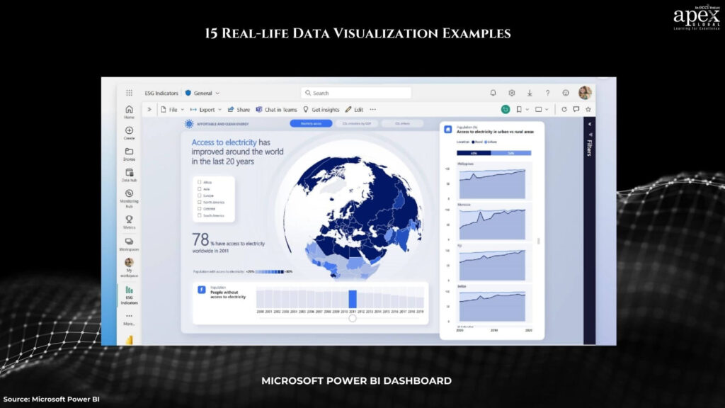
What You Can Learn: Integrating data visualization tools with widely used platforms, like Excel, broadens accessibility. Power BI’s capabilities empower users to generate insights from diverse data sources, promoting a more comprehensive understanding of organizational data.
9. NASA Mars Exploration Program Dashboards
Real-life Example: NASA’s data visualizations offer insights into the Mars Exploration Program. These visuals simplify complex scientific data, making information about space exploration more comprehensible to the general audience.
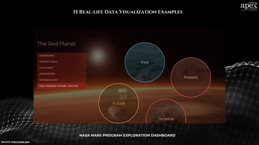
What You Can Learn: High-quality visuals play a crucial role in simplifying intricate scientific data. NASA’s use of data visualizations enhances public understanding of space exploration, contributing to increased scientific literacy.
10. Water Consumption
Real-life Example: Visualizing water consumption data helps understand usage patterns, answering questions about daily and yearly water usage. It provides insights into individual and collective water consumption habits.
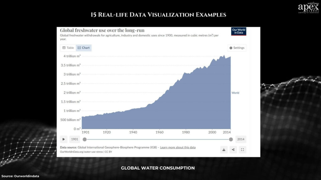
What You Can Learn: Data visualizations about essential resources, like water, aid in better resource management. Understanding consumption patterns is crucial for sustainable practices, and visualizations can effectively convey this information to a broader audience.
11. Plastic Waste Pollution
Real-life Example: Visualizing plastic waste pollution globally raises awareness about its environmental impact and associated costs. It emphasizes the urgency of addressing the global issue of plastic pollution.
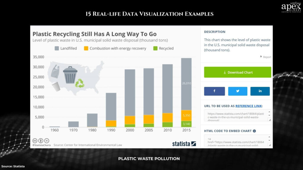
What You Can Learn: Data visualizations can serve as powerful advocacy tools, bringing attention to critical global issues. The combination of compelling visuals and impactful data prompts action and fosters a sense of responsibility.
12. Icebergs and Weather Change
Real-life Example: Visualizing the relationship between icebergs and climate change makes the impact of rising temperatures evident. This data visualization aids in understanding the interconnectedness of climate-related phenomena.
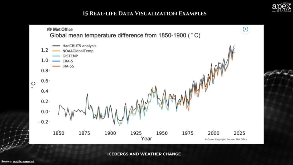
What You Can Learn: Visualizing cause-and-effect relationships, especially in complex topics like climate change, helps convey the urgency of the issue. It encourages viewers to connect with the subject matter on a deeper level.
13. Visualizing Pandemic History
Real-life Example: Data visualizations depicting the history of pandemics showcase past outbreaks and affected regions. These visuals provide valuable insights for understanding patterns, preparing for future events, and assessing risks.
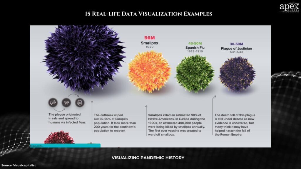
What You Can Learn: Visualizing historical pandemic data aids in identifying trends and patterns, contributing to improved preparedness for future health crises. The educational aspect of such visualizations enhances public awareness and knowledge.
14. Fossil Fuels
Real-life Example: Visualizing the drawbacks of fossil fuels, including contributions to climate change and environmental pollution, emphasizes the need for sustainable energy sources. The visualization prompts viewers to consider alternative, eco-friendly options.
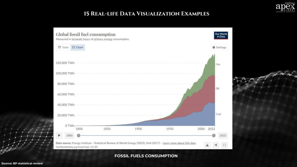
What You Can Learn: Data visualizations can effectively communicate the negative impacts of certain practices, fostering a collective understanding of the need for sustainable solutions. They play a role in shaping public opinion and encouraging environmentally friendly choices.
15. Help Businesses Understand Complex Issues
Real-life Example: Visualizations aiding businesses in communicating complex information to customers enhance product and service understanding. These visuals simplify intricate data, making it accessible to a broad audience.
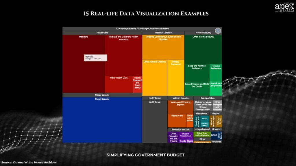
What You Can Learn: Well-designed data visualizations support businesses by providing clear and simple representations. The accessibility of information contributes to improved customer understanding and informed decision-making.
Empowering Change Through Data Visualization
In conclusion, these real-life examples showcase the versatility and power of data visualization. From unraveling the intricacies of global issues to simplifying personal preferences, each visualization tells a unique story. As we continue to navigate the era of big data, the lessons learned from these examples underscore the importance of interactivity, customization, and impactful storytelling in creating meaningful and insightful visualizations. Data visualization not only decodes complexity but also empowers individuals and organizations to make informed decisions, fostering a deeper understanding of the world we live in.