Data visualization has become an indispensable part of modern business strategy. In a world awash with data, it’s the compass that guides decision-makers through the treacherous sea of information. From pie charts to interactive dashboards, data visualization techniques and tools are the key to unlocking insights and making informed decisions. In this comprehensive guide, we’ll take you on a journey through the data visualization landscape, covering everything from its importance to the stages, techniques, and a variety of tools at your disposal.
What you'll find in this article
- 1 What is Data Visualization?
- 2 Importance of Data Visualization
- 3 Factors to consider when Choosing visualization techniques and tools
- 4 Stages
- 4.1 1. Data Collection
- 4.2 2. Data Cleaning
- 4.3 3. Data Analysis
- 4.4 4. Data Visualization
- 4.5 5. Interpretation
- 4.6 Techniques
- 4.7 1. Pie Chart
- 4.8 2. Bar Chart
- 4.9 3. Histogram
- 4.10 4. Gantt Chart
- 4.11 5. Heat Map
- 4.12 6. Box and Whisker Plot
- 4.13 7. Waterfall Chart
- 4.14 8. Area Chart
- 4.15 9. Scatter Plot
- 4.16 10. Kernel Density Estimation for Non-Parametric Data
- 5 Tools
- 6 Importance of Data Visualization for Business
What is Data Visualization?
Data visualization is the art of translating complex datasets into easily understandable visual representations. It goes beyond mere numbers and spreadsheets, transforming information into graphs, charts, maps, and diagrams. These visuals provide clarity, allowing even non-technical individuals to grasp insights hidden within the data.
Importance of Data Visualization
Data is often called the new oil, and for a good reason. The modern business landscape is flooded with data, and its interpretation is crucial for success. Data visualization plays a pivotal role by:
Enhancing Comprehension: Visuals are processed faster and more intuitively than raw data, making information more accessible to a broader audience.
Aiding Decision-Making: By presenting data in a visually appealing way, it helps decision-makers understand trends, patterns, and outliers, leading to more informed choices.
Storytelling: It enables data analysts to weave compelling narratives through visuals, turning data into stories that resonate with stakeholders.
Spotting Anomalies: Visualization can quickly highlight anomalies and errors in data, helping organizations maintain data accuracy.
Now that we’ve established the importance, let’s delve deeper into the factors that influence the choice of data visualization techniques and tools.
Factors to consider when Choosing visualization techniques and tools
Data visualization isn’t a one-size-fits-all solution. Choosing the right technique and tool depends on several critical factors:
1. Type of Data
The type of data you’re working with significantly influences the visualization technique. For time-series metrics, line charts may be the best choice, while scatter plots are often used to show relationships between two elements.
2. Story You’re Telling
The narrative you want to convey plays a vital role in selecting the visualization approach. Visualization should be aligned with the message you want to communicate.
3. User and Purpose
Tailoring data representation to the specific audience is essential. Different users have varying levels of expertise, so the complexity of visualizations should be adjusted accordingly.
4. Capabilities of the Tool
The capabilities of the data visualization tool are crucial. Some tools are better suited for simple, static charts, while others offer advanced features for dynamic, interactive dashboards.
The data visualization process can be broken down into several stages, each serving a unique purpose.
Stages
1. Data Collection
The first stage involves gathering the raw data from various sources. This is where you accumulate the numbers, texts, or other information that will eventually be visualized.
2. Data Cleaning
Once you have the data, it’s essential to clean it. This process involves removing inconsistencies, dealing with missing values, and ensuring that the data is accurate and reliable.
3. Data Analysis
In this stage, data analysts or scientists explore the dataset to extract meaningful insights. This might involve statistical analysis, data mining, or other techniques to uncover patterns and trends.
4. Data Visualization
This is the heart of the process. It’s where the data is transformed into visual forms, such as charts, graphs, maps, or interactive dashboards.
5. Interpretation
The final stage involves interpreting the visualized data. This requires the ability to draw conclusions and make informed decisions based on the insights derived from the visuals.
Now, let’s explore some of the most common data visualization techniques used in the industry.
Techniques
1. Pie Chart
A classic choice for showing parts of a whole. It’s great for illustrating proportions, such as market share or budget allocation.
2. Bar Chart
Bar charts are excellent for comparing data points. They come in various forms, like vertical or horizontal bars, and can visualize data categories with ease.
3. Histogram
Histograms are used to display the distribution of a dataset. They show how often each value appears within a range.
4. Gantt Chart
Commonly used for project management, Gantt charts display tasks and their duration. They provide a clear timeline view of a project.
5. Heat Map
Heat maps use color gradients to represent data values, making it easy to spot patterns in large datasets.
6. Box and Whisker Plot
These plots offer a visual summary of a dataset’s distribution, including median, quartiles, and potential outliers.
7. Waterfall Chart
Waterfall charts are perfect for tracking the cumulative effect of sequentially introduced positive or negative values.
8. Area Chart
Area charts display data in a series, with the areas beneath the lines filled with colors to represent quantities.
9. Scatter Plot
Scatter plots visualize relationships between two variables, showing how one variable impacts another.
10. Kernel Density Estimation for Non-Parametric Data
This technique is useful for estimating the probability density function of a random variable when parametric assumptions aren’t valid.
As you embark on your data visualization journey, the choice of tools is a critical decision. Here are some of the most prominent tools available:
Tools
1. Google Charts
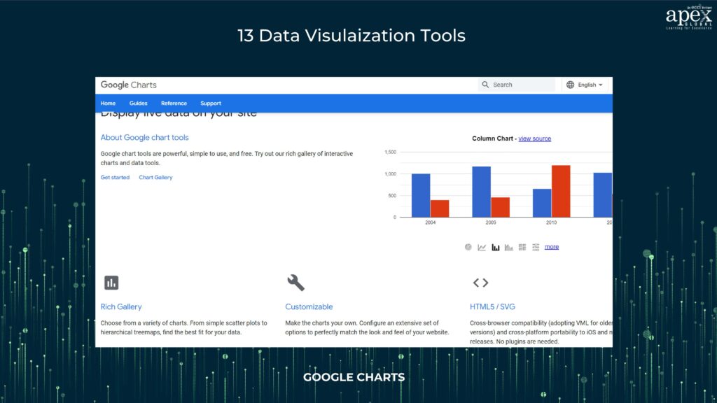
A user-friendly tool for creating a variety of charts and graphs that can be easily embedded into web applications.
Pros:
– User-friendly tool.
– Easily embeddable into web applications.
– A wide range of chart types is available.
Cons:
– Limited customization options.
– Less suitable for complex visualizations.
2. Tableau
A leader in data visualization, Tableau provides both ease of use for casual users and advanced analytics for data professionals.
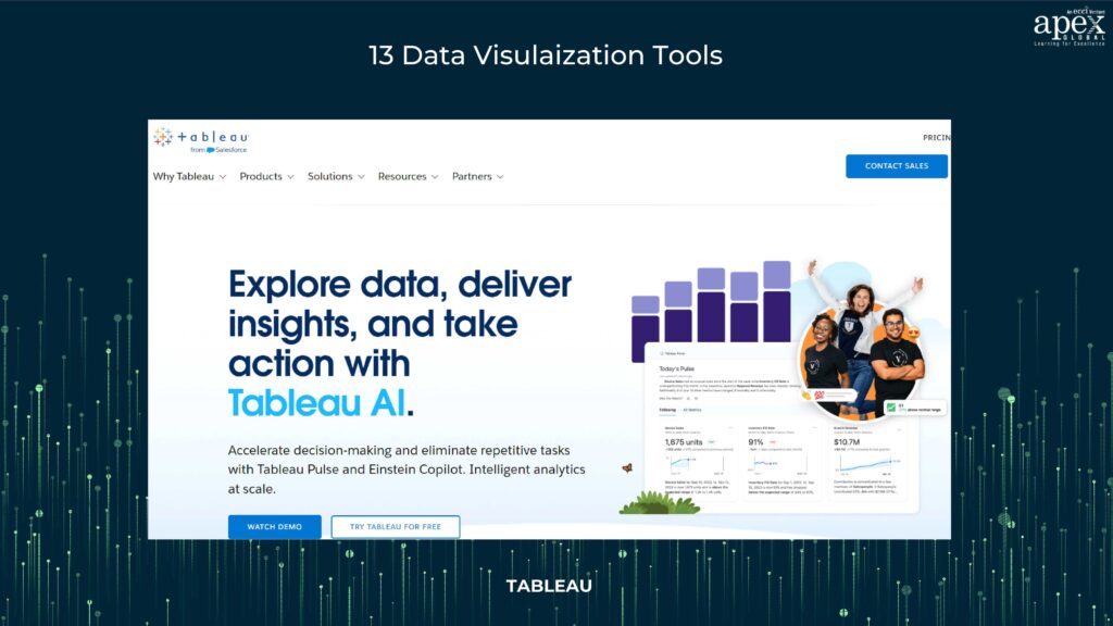
Pros:
– Leader in data visualization.
– User-friendly for casual users.
– Advanced analytics for data professionals.
Cons:
– High pricing for full-feature versions.
– Steeper learning curve for advanced features.
3. Grafana
This open-source platform specializes in creating dashboards and monitoring data. It’s particularly well-suited for time-series data.
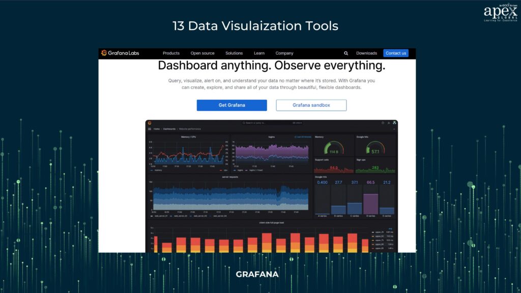
Pros:
– Open-source and flexible.
– Specialized in creating dashboards and monitoring data.
– Well-suited for time-series data.
Cons:
– May require technical expertise for advanced usage.
– Not ideal for complex analytical needs.
4. Chartist.js
Chartist.js is an open-source library for creating responsive, customizable, and interactive charts and graphs.
Pros:
– Open-source and customizable.
– Responsive and interactive chart creation.
Cons:
– Limited chart types compared to other tools.
– Less suitable for complex data analysis.
5. FusionCharts
FusionCharts is known for its versatile platform for creating interactive dashboards on the web and mobile. It offers a wide range of charts and maps.
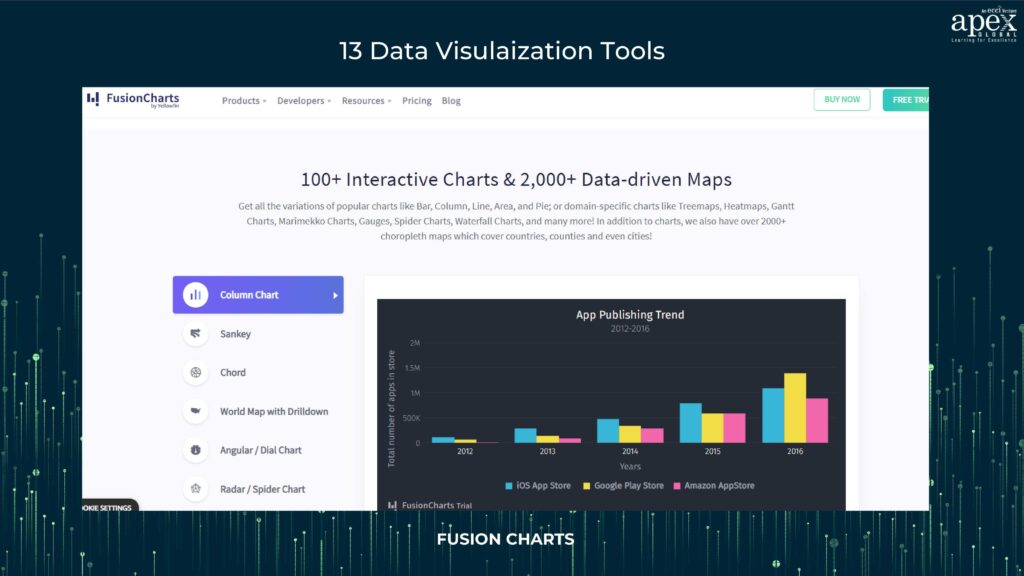
Pros:
– Versatile platform for web and mobile.
– Rich integration capabilities.
– Wide range of charts and maps.
Cons:
– Paid tool, which can be expensive.
– May require more advanced technical skills.
6. Datawrapper
An easy-to-learn tool that allows users to create engaging visualizations without design and coding skills.
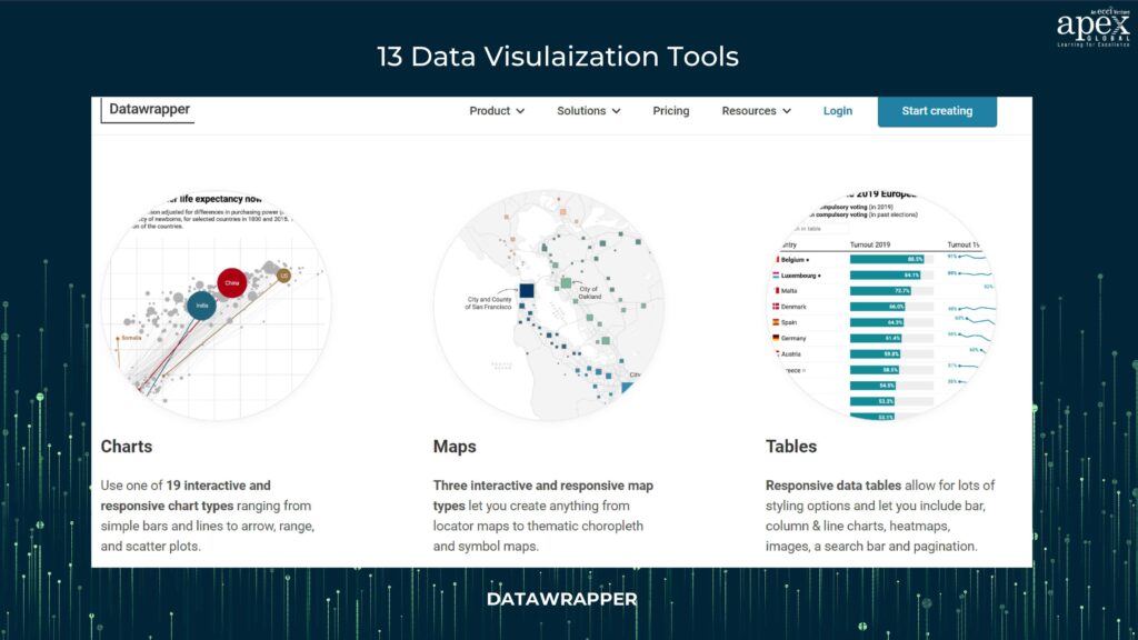
Pros:
– Easy-to-learn and no-code tool.
– Engaging visualizations without design or coding skills.
– Provides customization options.
Cons:
– Limited advanced features.
– May not be suitable for complex data.
7. Infogram
Infogram offers a range of no-code tools with dozens of templates and customization options across various data visualization methods.
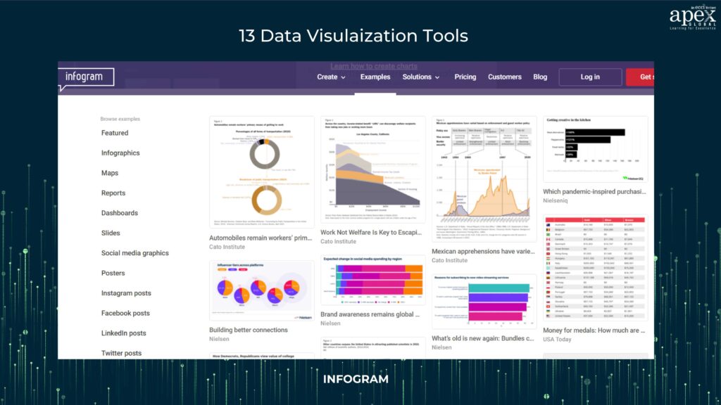
Pros:
– No-code tool with templates.
– Good for creating engaging visual content.
Cons:
– Limited customization and flexibility.
– Less suitable for advanced data analysis.
8. ChartBlocks
ChartBlocks is another no-code tool that provides templates and customization options, making it easy to create data visualizations.
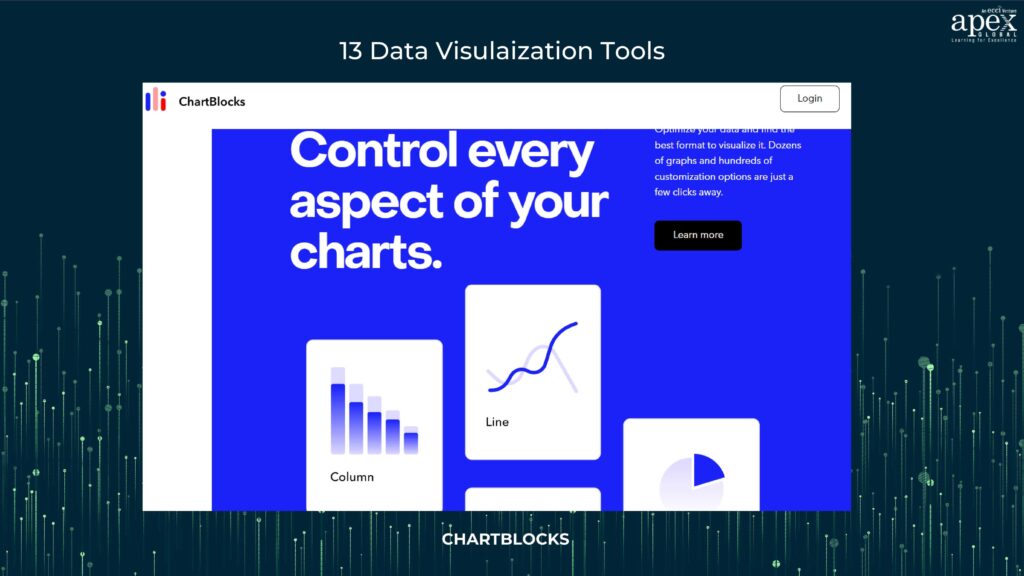
Pros:
– No-code tool with customization.
– Provides dozens of templates.
Cons:
– Limited chart types.
– Less suitable for complex data visualization.
9. D3.js
D3.js is a powerful JavaScript library for creating data-driven documents. It provides immense flexibility for building custom visualizations.
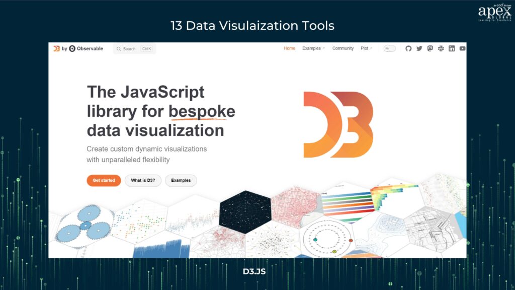
Pros:
– Extremely customizable and flexible.
– Suitable for creating interactive, unique visualizations.
Cons:
– Steeper learning curve.
– Not ideal for beginners.
10. Visme
Visme is known for its user-friendly interface and offers a rich library of interactive visualizations and data representation techniques.
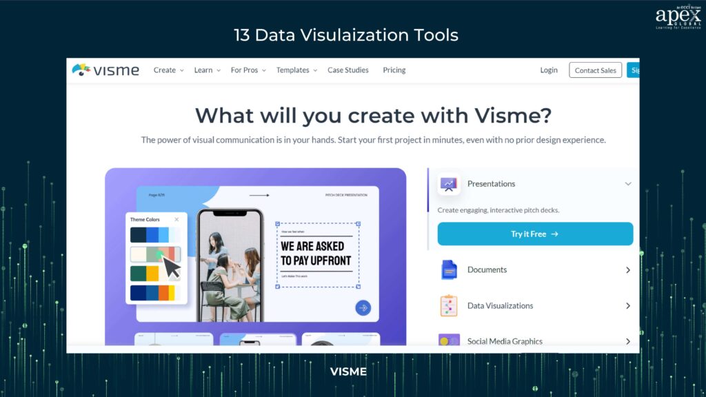
Pros:
– No-code tool with various templates.
– User-friendly interface.
Cons:
– Limited customization options.
– Less suitable for complex data analysis.
11. Whatagraph
Whatagraph is a reporting automation platform that simplifies data visualization for marketing agencies and professionals.
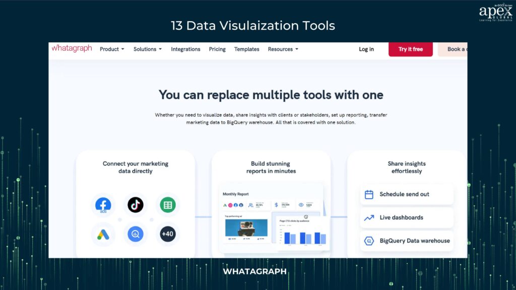
Pros:
– Good for creating marketing reports.
– Integrates with multiple marketing platforms.
Cons:
– Specialized for marketing and reporting, not general data visualization.
– Limited chart types.
12. Sisense
Sisense is an industry-grade data visualization tool with rich analytics capabilities, a cloud-based platform, and support for multiple data sources.
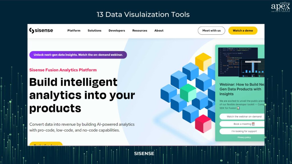
Pros:
– Cloud-based and supports various data sources.
– Offers natural language queries.
– Flexible in terms of integration.
Cons:
– More expensive than some other options.
– May be overly complex for basic needs.
13. DataBox
Databox is designed for real-time business analytics and performance tracking. It provides a user-friendly interface for creating dashboards.
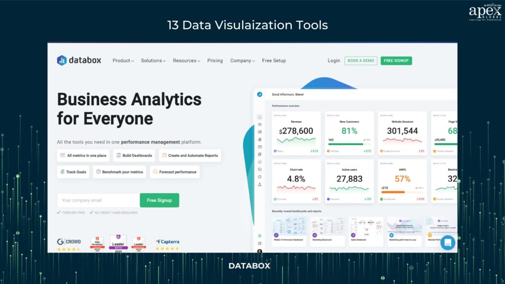
Pros:
– Real-time business analytics and performance tracking.
– User-friendly interface for creating dashboards.
Cons:
– Limited in terms of complex data analytics.
– May not be suitable for advanced data scientists.
Importance of Data Visualization for Business
Data visualization is the linchpin of modern business operations. It bridges the gap between raw data and meaningful insights, enabling organizations to make informed decisions, innovate, and optimize their processes.
Data visualization is the universal language of data. It transforms complex information into visuals that anyone can understand, making it an essential tool for effective communication within organizations.
As the significance of data visualization continues to grow, the demand for individuals proficient in this field is on the rise. These experts are essential for translating data into actionable insights.
APEX Global Learning’s Data Science courses are known for hands-on training, real-world projects, and expert instructors. Gain practical skills and industry knowledge for a successful data science career. Ready to master Data Visualization? Explore our guide and take your skills to the next level with our Data Science courses.
In this data-driven era, data visualization is more than just creating pretty charts—it’s about turning data into power. Armed with these techniques, tools, and insights, you’re now equipped to embark on your data visualization journey. Choose your tools wisely, select the right techniques, and craft visuals that will illuminate your path to better decision-making and a brighter future for your business.